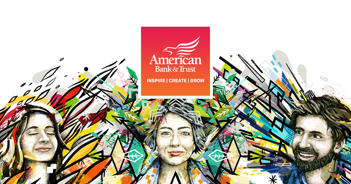
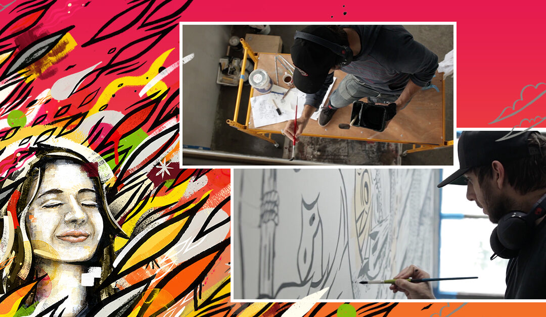
It’s only been a few weeks since we introduced our new American Bank & Trust brand, but interest has been high in the vibrant art that is at the center of our visual system. A lot of people have asked, how did we choose this approach to telling our story — and who is the artist that created the work?
His name, appropriately, is Eugene Good, an artist based in Portland, Oregon, who has spent time working in the Midwest, the Mountain West, and ultimately the Pacific Northwest.
“Storytelling is what I love,” Good explained. “I’ve always wanted to paint big. It’s intimidating, because there’s nowhere to hide with big, but there are artists who do it all the time. What allowed me to get into it with this project is that I let myself use a little bit of my style to create a story around the bank.”
Good, who splits his time as a visual artist and an art director in the advertising and graphic design world, has had a variety of experience in shaping brands from Nike and Salomon to small businesses like restaurants and skateboard companies. AB&T’s advertising partner, Epicosity, called on his unique skillset to help create the new brand.
“I’ve had great exposure to brand building doing digital design,” Good said. “At the same time, I’ve always had a passion for painting. It’s a curse and a blessing having two directions — one more rule-driven than the other.”
AB&T’s enthusiasm for making painting the primary expression of our brand sprung from a simple insight. At our core, our bank is about being creative and bold. Once we understood that our true purpose at American Bank & Trust is to deliver creative freedom to our customers, our communities, and our team, it made sense that we would depict that idea with art — that we would cut against the standard fare in bank marketing. An identity built around paint is not something you’ll find anywhere else in banking.
In order to execute visually on the idea of creative boldness, we needed to find the right combination of artistic skills with which to build our design system. That was Eugene Good.
On the one hand we needed a painter, but we wanted that person to deliver a contemporary, cosmopolitan energy to the work. We wanted the mind and skillset of a mural artist, someone who could create immersive worlds of inspiration. Good has done numerous mural art projects along with large-scale art installations. So he was a good fit for us.
On the other hand, our artist would also need to work in a digital format. The new AB&T identity would be based on painting but live in a lot of other media, like newspaper ads, social media posts, flyers and television commercials. So it was essential to develop assets that could be repurposed in multiple media. Again, Good was the fit.
All that was needed next was vision.
“I felt, if we build a toolkit of these elements, it would be effective for the brand with color and pattern,” Good said. “It has a lot of legs, you’re not pigeon-holed into one look. And art is constantly evolving — you’re not just stuck with one graphic, one shape. You’re flowing with versatility.”
Both customers and staff members have reacted with enthusiasm. The consensus was that the look Good and Epicosity developed stands way out from more conventional approaches to bank marketing. And of course, that was the idea.
“I’m hoping with the color palette itself and the forward thinking of the directional patterns, I hope people feel more brightened inside and feel inspired — and that people don’t feel this is a stuffy old bank,” Good explained. “I want people to feel an experience and want more of it.”
And that’s precisely the same sentiment we have at the bank. We look forward to spotlighting more of Eugene’s work as we continue to grow our new brand.


